Introduction
When most people create presentations, they try to stuff as much information on a page as they can so they don't have to remember very much. But the point of a presentation is to get your point across as quickly, effectively, and efficiently as possible. If your presentation is too cluttered with weird design elements like distractive watermarks, poorly arranged figures or terrible text font choices, you'll lose the interest of your audience before you have a chance to get to your take-home message.
I prefer to keep things simple. This is especially important when creating a presentation. Here are there are no frills. Just a simple, sleek, uncluttered template that helps YOU focus on the creation process and your AUDIENCE focused on your message.
Features
- I've designed this template to aid new presenters in the creation process. Every page includes a title | subtitle that helps you keep your content organized into sections and topics. This helps your audience follow along easily because they'll come to expect this organization with each new slide. This is especially useful for students in both the creation and learning process.
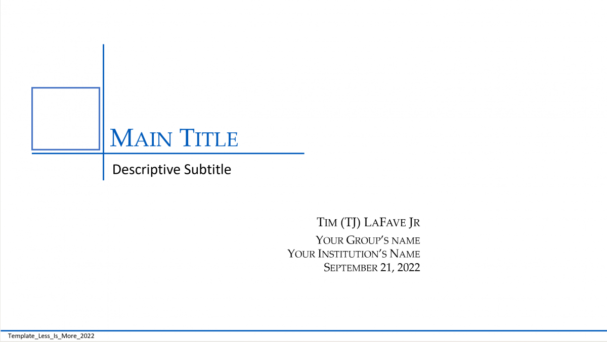
- The title page is simple. It includes your group's logo (just replace the blue square with your own graphic in the Master Slide) so your audience knows right away they're in the right place. The Main Title may be a common theme you cover for a week and the subtitle is each presentation's specific subject matter. In the bottom left-hand corner is the filename so your audience knows which file to look for if you post your content online.
- There's a Table of Contents page so your audience gets a quick overview of what's to come, and there are clickable links to each subject. In the bottom right corner is your group's name and the URL where everyone can visit for more information, and the page number in case your audience wants to refer to specific pages during questions.
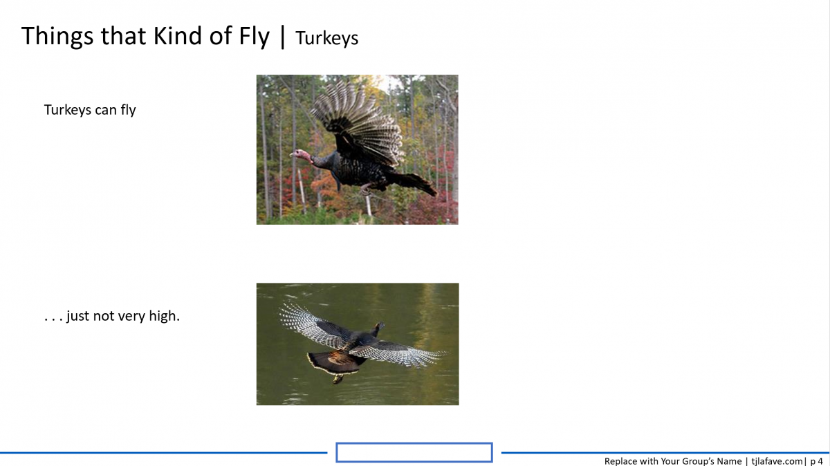
- Every page has a Title | Subtitle format (32 pt | 24 pt) to keep your content organized and your message on track. In the bottom center is a blue square you can replace with your own image, but the square is clickable so you can always get back to the table of contents without having to scroll through the entire slide deck. One thing I love to use this feature with is large slide decks of dozens of slides. I just create a new table of contents slide for each type of presentation I want to create, then follow through the links to/from each slide and back to the table of contents for a link to the next slide.
Bottom line: LESS IS MORE.
Available Template: (09/21/2022)
Less is More .PPTX
 |
 |
 |
